The Project
January 2024
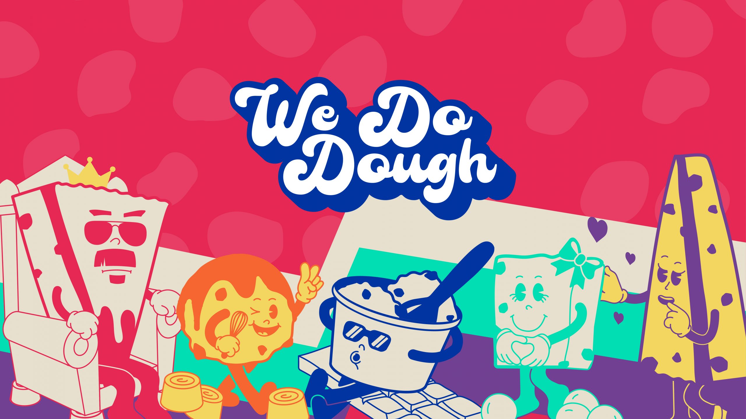
Bringing nostalgia to the cookie dough trade.
IN BRIEF
We Do Dough was established in 2020 in lockdown, creating delicious cookie dough goodies. We were challenged to create a striking visual identity that would make consumers stop and think when interacting with the brand touch points.
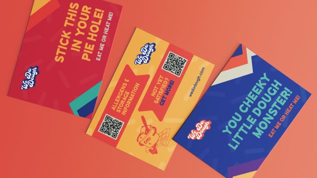
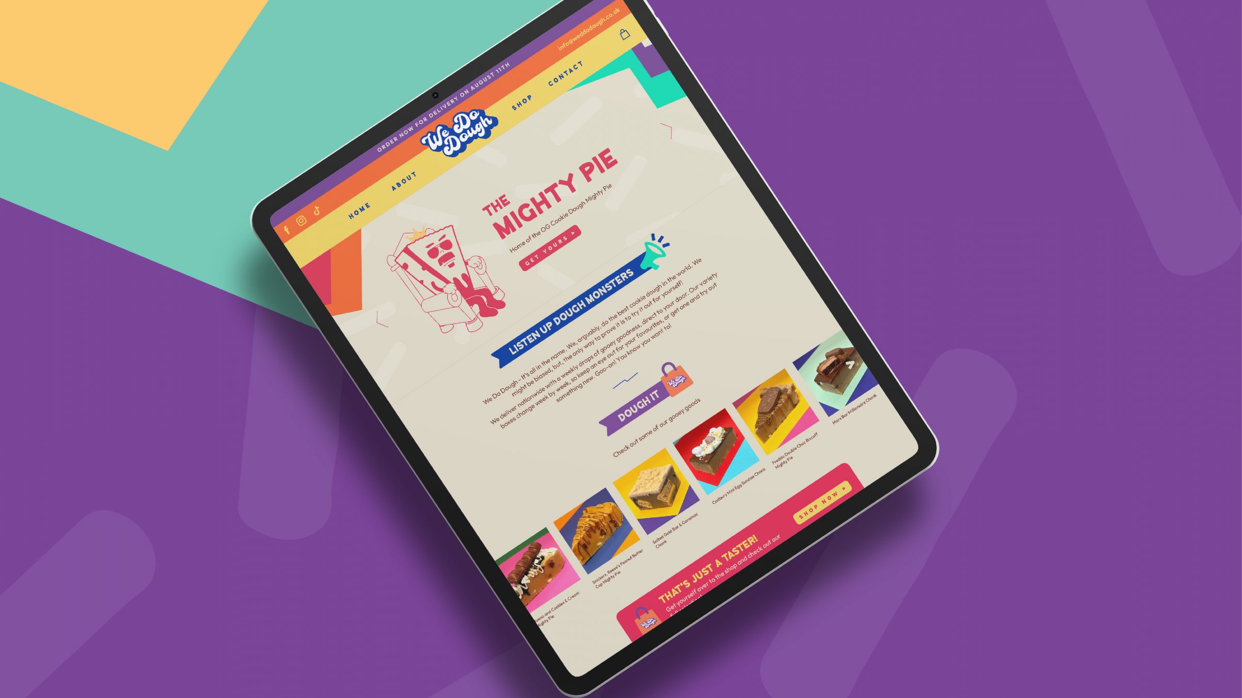
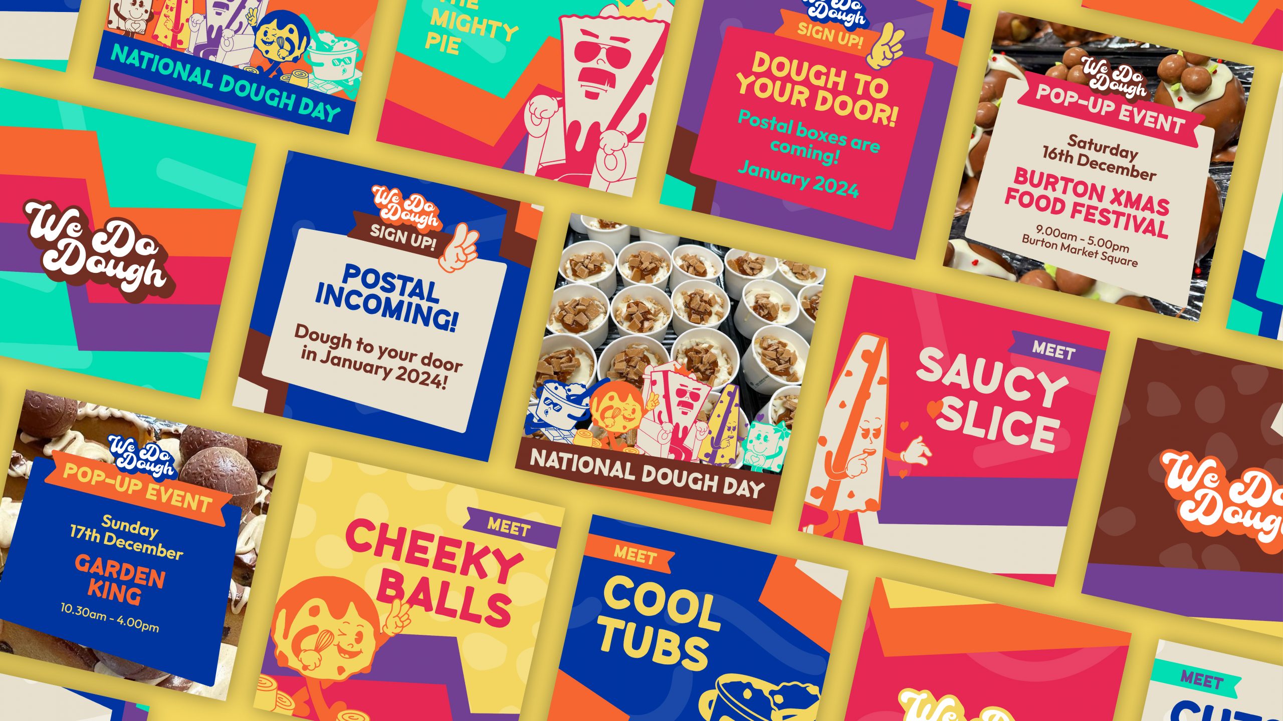
This new visual identity would then need to be brought across and implemented into print, packaging, social assets, and a website as the brand looked to create a new online storefront.
WHAT WE DID
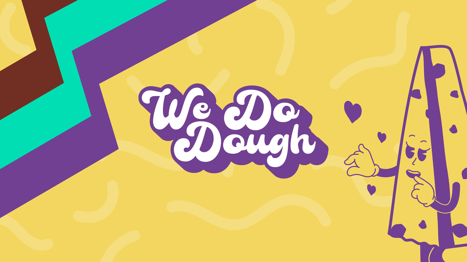
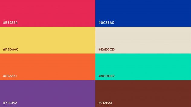
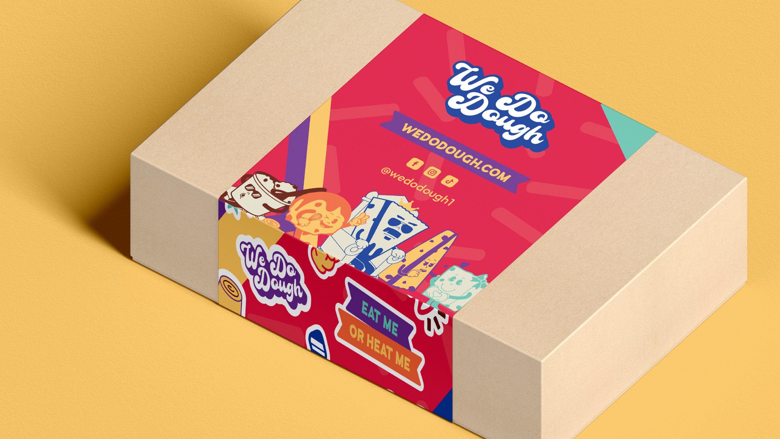
We handpicked each colour of the colour palette based on inspiration taken from some of the We Do Dough’s favourite ingredients.
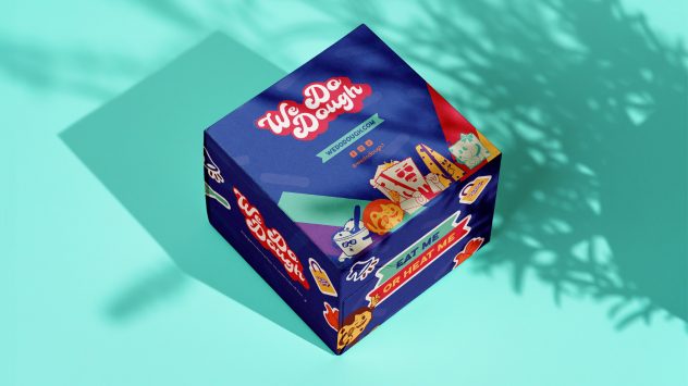
The main principle behind the packaging was to place the logo up front and centre on top of the boxes along with the website/social details. This way, when customers are carrying their boxes of dough around pop-up events, they’ll be marketing the brand at the same time, telling other customers exactly where they got it from and where they can get theirs.
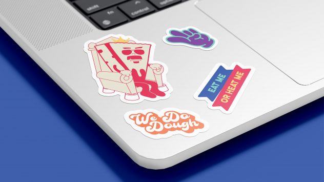
Once this hierarchy of information was established, the retro characters and icons were placed strategically around the packaging to bring some liveliness to it.
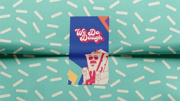
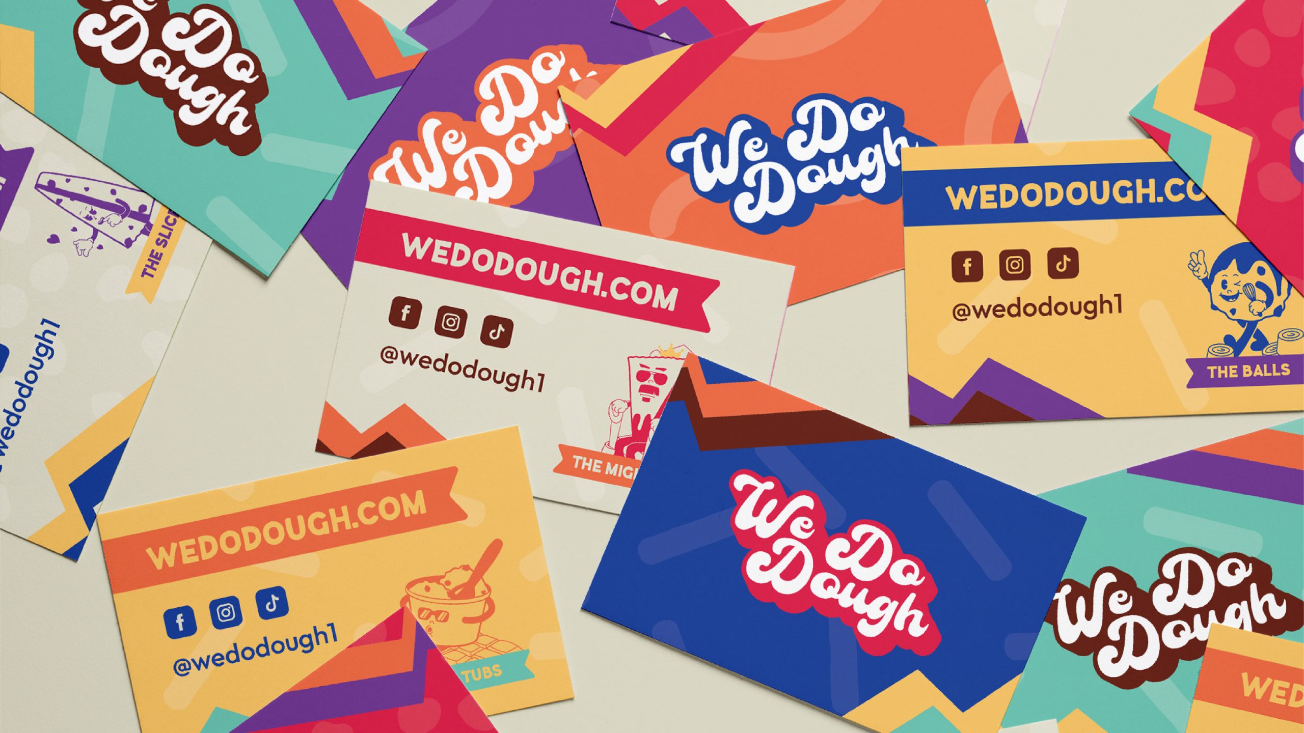
Inspired by a 90’s design styling, ideation commenced, creating 7 mascots to represent the 7 different products on display – The Mighty Pie, Chonks, Balls, Slices, Trays, Tubs and kids products.
These mascots could be used altogether when talking about the brand as a whole, individually when selling each product or when highlighting key information. They have been created to be fun and engaging, yet with a bit of edge to them to appeal to customers of all ages.