The Project
June 2020
‘Most people spend too much of their working lives in beige boxes, dressed as someone else.’ This is why Space With-in exists.
We were thrilled to have been commissioned to work with Space With-in to develop the brand look and feel. As the brain-child of Laura, the brand was a complete reflection of her, her practice and collaborations with others.
The process of creation began with a strategy scope session, which took the form of a series of questions and an interview to understand the workings behind Space With-in. From this we developed a report write up that outlined all of the key points of information. This process was incredibly insightful and enlightening and we enjoyed it as much as Laura did.
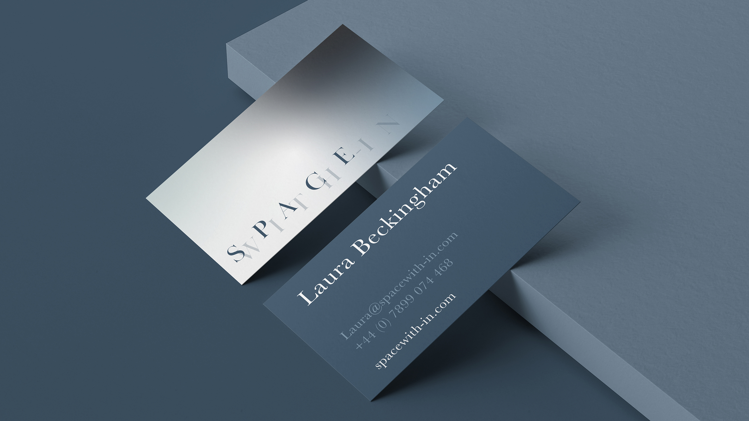
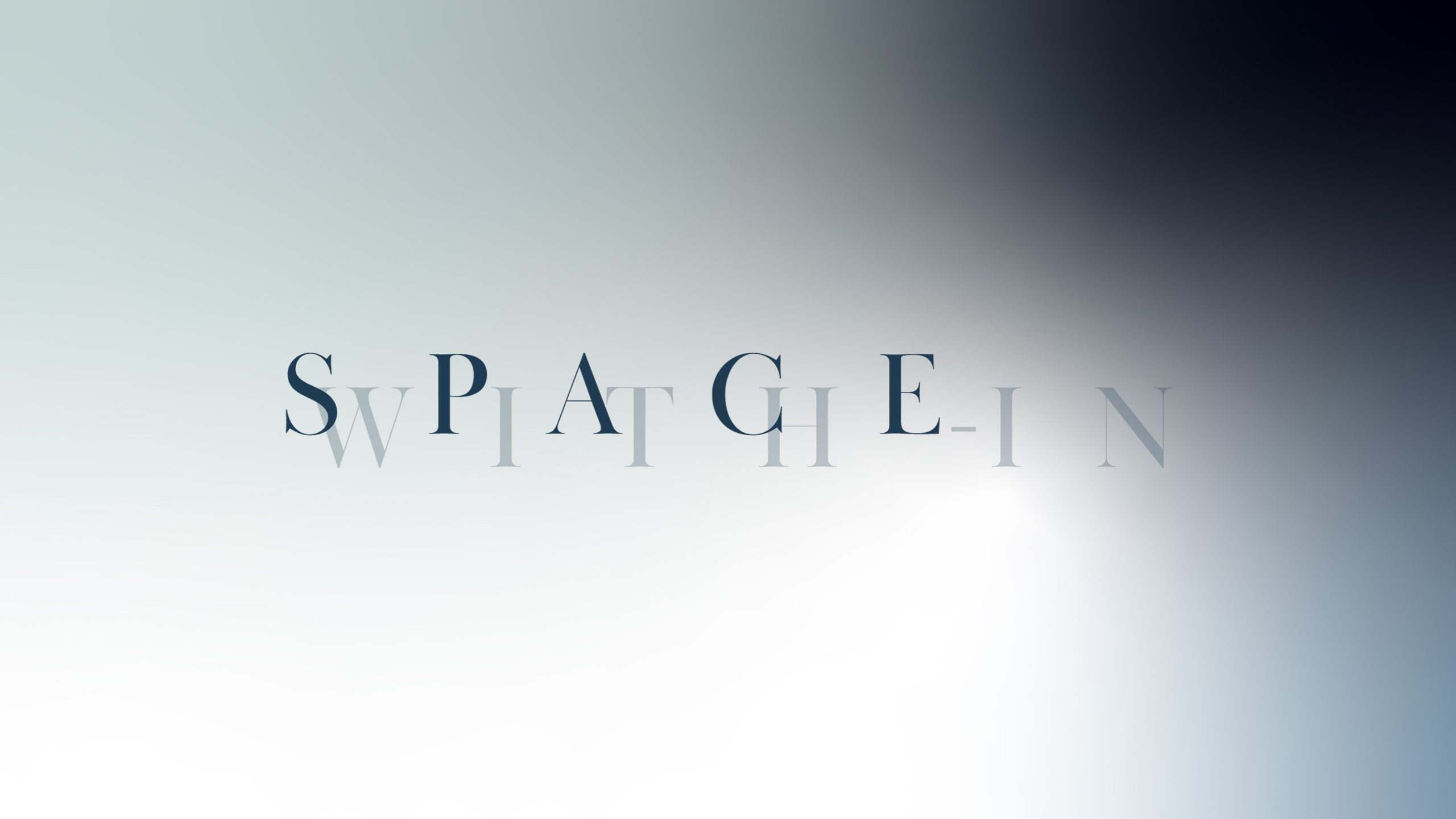
Following this, we then devised the creative brief, creating some anchor points for us to refer back to whilst making our way through the journey of creation. Our key thoughts were around oxymoron and juxtaposition. Movement, yet stability. Vection. All of these elements posed a complex set of challenges. How do we create something that is solid state yet floating? We worked through multiple concepts, researching colour, typography, shape, positioning, layout, combinations of type and colours and background. Imagery with cuts out, layers of effects. We finally arrived at the overlay typography which has been cut to sit interlocking set on the gradient background, bringing in depth through colour and a sense of fear and enlightenment through the positioning of the tones.
We pulled all of these elements together to create a simple yet informative usage guide, allowing all involved in developing the brand and it’s assets and links to retain continuity across all pieces.
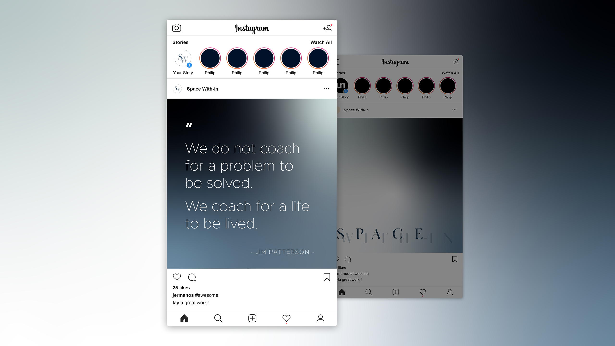
The typography sets and the colour ways have been cut for backgrounds as social posts and we are in the process of integrating the creative look and feel into the website.
We look forward to working with Space With-in to develop the website and additional assets.
