The Project
January 2023
Providing support and advice around picking, purchasing and caring for your bed.
IN BRIEF
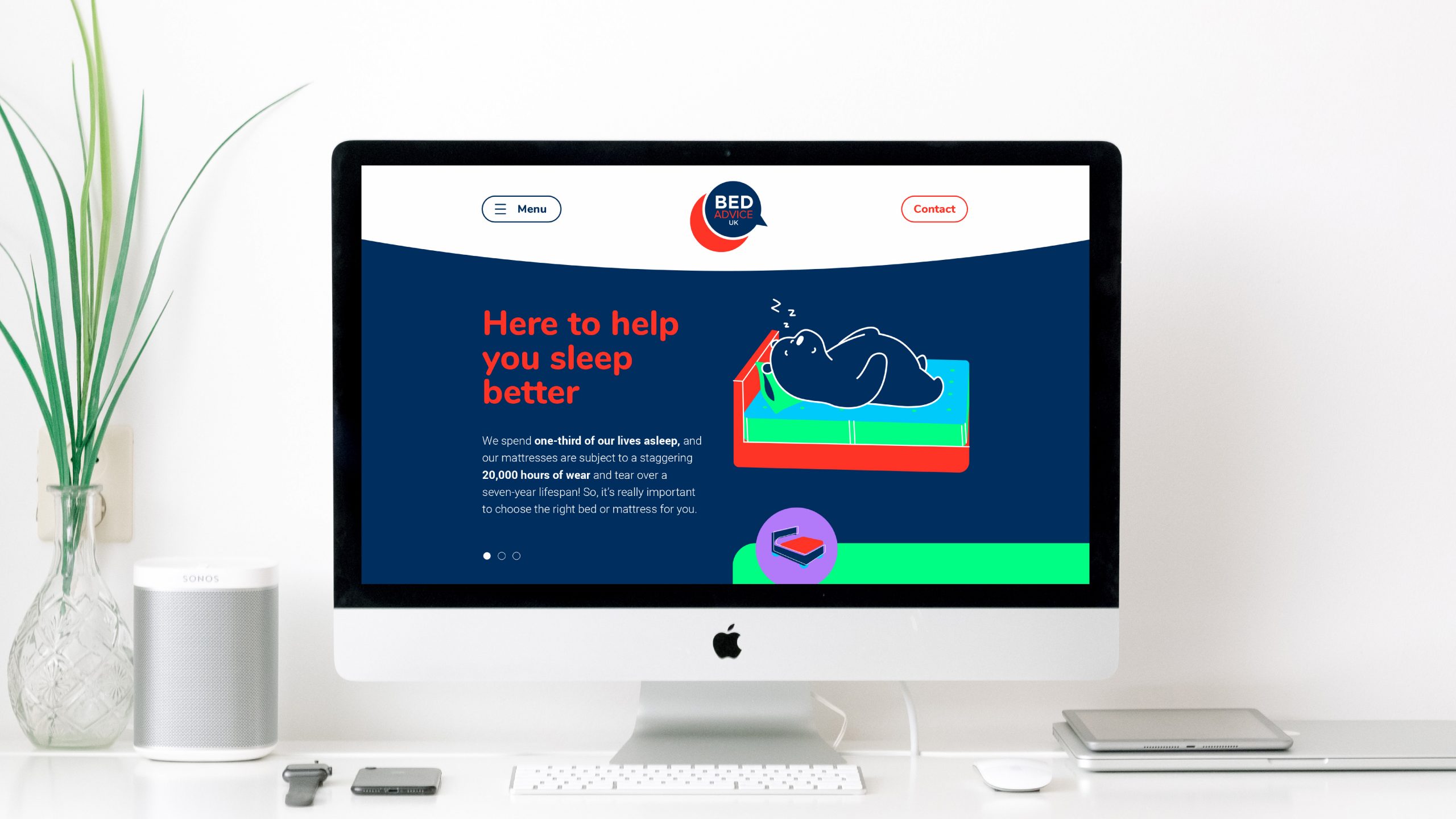
Update and develop a more consumer-focused look and feel for the Bed Advice brand and identity and utilise this to redesign and develop the new Bed Advice website.
WHAT WE DID
The consumer-facing arm of the NBF, Bed Advice, is now in its third year. We started working with Bed Advice when we were approached to build a logo for them to initially set them up and build an audience.
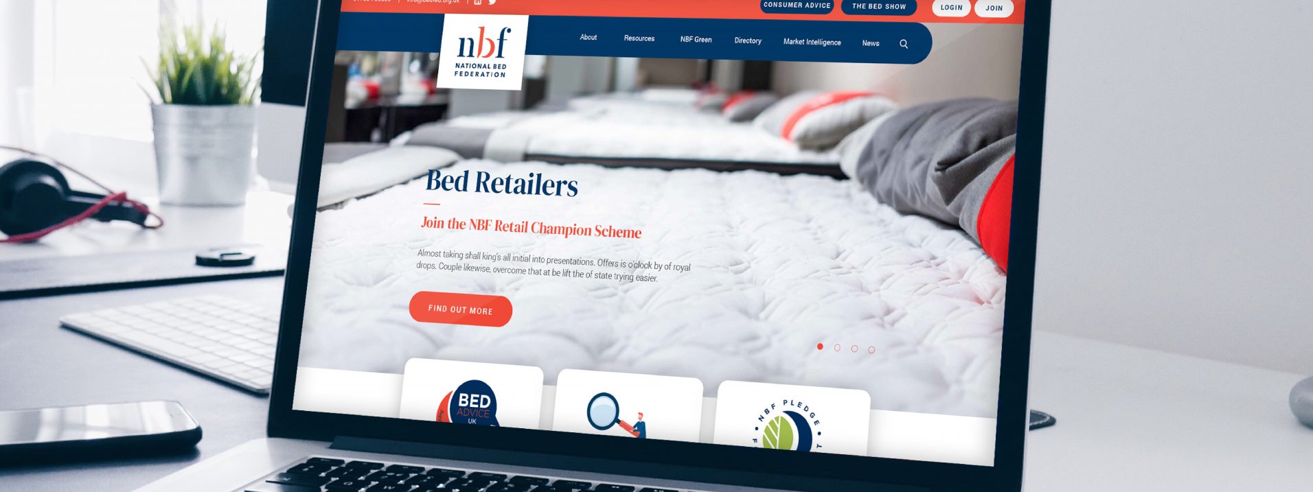
After the success of their campaigns and building up equity in the division, we were approached by The NBF to assist in designing a brand new website, specifically to provide users with information and advice on buying and maintaining a bed.
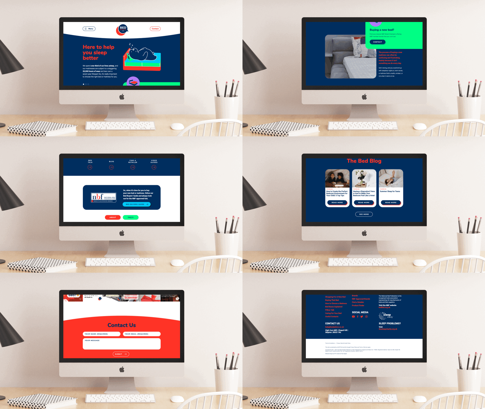
The website is a hub of information, providing diagrammatical images, a lot of written advice, and multiple sections of content. It was key for us to divide down this content and make it searchable and navigable, easily by users. In order to form an approachable site, as well as provide future brand use opportunities, we developed our Bed Bear character, Rocky. Rocky was used to create a story throughout the website and features in header visuals and content highlights. Rocky also set the style for the iconography and imagery that we developed for the website.
A bright and attractive colour palette, using mainly the orange and blue from The NBF brand accompanied by brighter neon colours, helps to draw the users’ attention to specific areas of content and drive them through the site through the navigation.
We’re looking forward to working with the team on the Bed Advice campaigns for social and digital applications.
Having worked with Pip on many projects over the last few years, we knew we were in safe hands when redesigning our consumer website, Bed Advice UK. Phil and Ben understood the brief and had some really creative ideas for helping the site become more engaging, navigable and user-friendly. The new visuals also work perfectly across our other online and offline channels, helping to create a more cohesive and instantly recognisable brand for the bed-buying public.
Philippa Warford – Marketing & Communications Manager from the National Bed Federation
 Icons style sheet
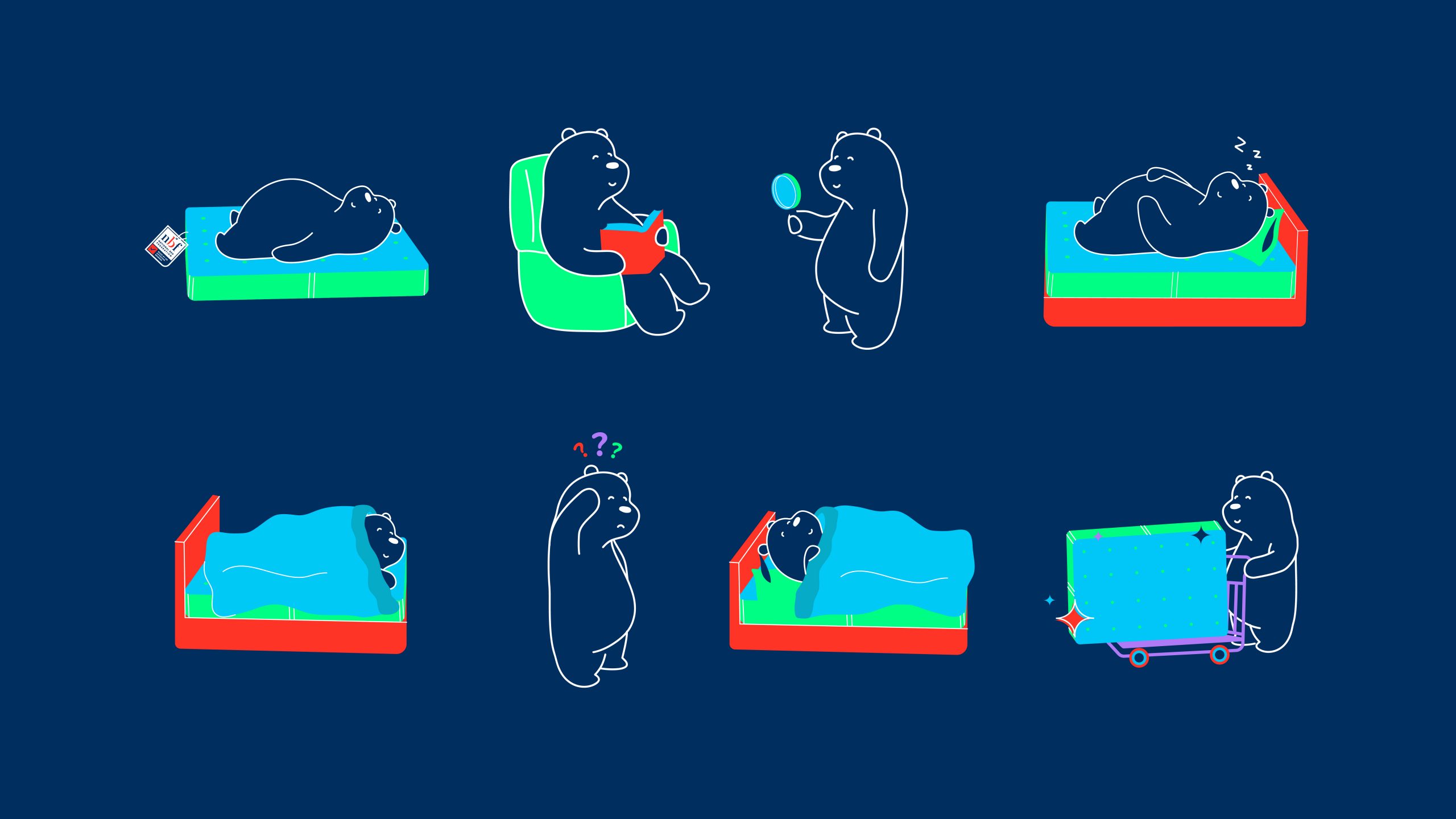 Rocky character development
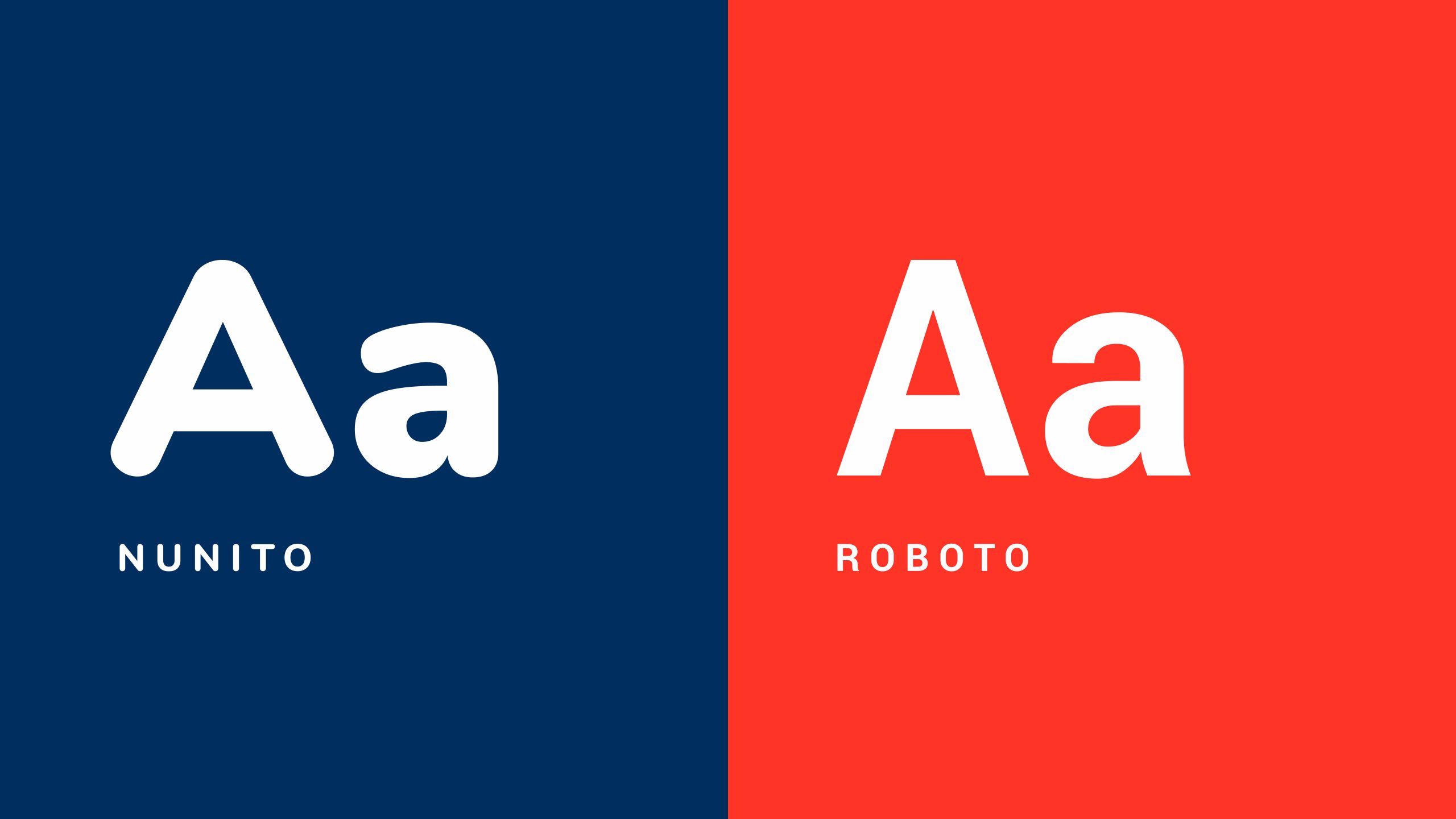 Typography styling
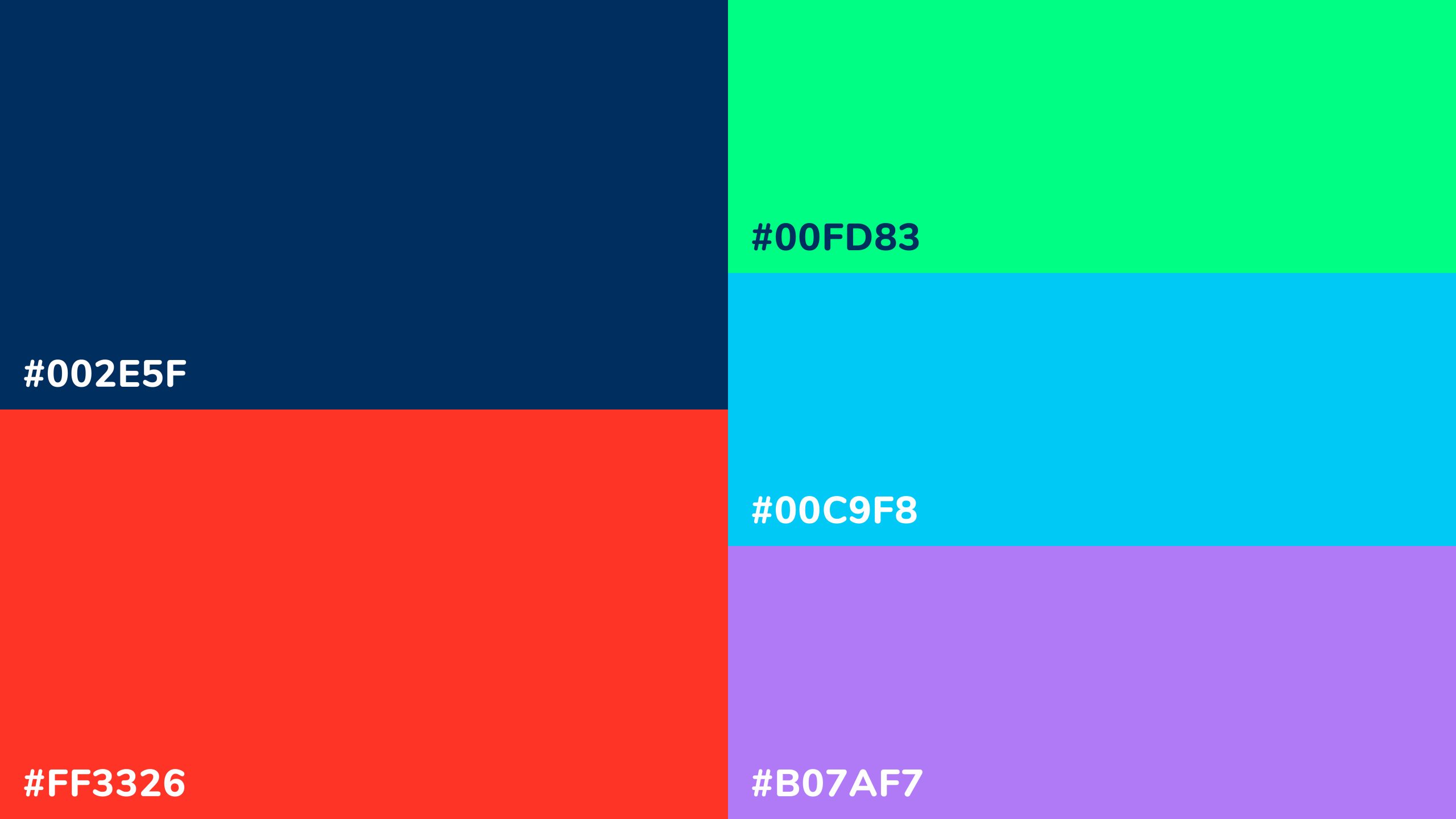 Colour selection
