The Project
March 2022
Sleep deprivation and sleep issues are an epidemic. The Sleep Charity is changing the way help is provided.
IN BRIEF
Sleep is an issue throughout the UK and The Sleep Charity are working to develop programmes to reduce the impact that sleep deprivation is having.
The Sleep Talkers programme is a National Lottery Funded project that is aimed at creating training and developing resources for communities around the UK. This information is then presented to volunteers training to be Sleep Talkers Trainers – they will then go on to disseminate this information at local levels.
WHAT WE DID

Initially, Sleep Talkers’ aim is to work with Parents of Children with SEND. This community has been highlighted as sleep deprivation levels are high in both parents and children. The programme is designed to highlight the issues to look out for and provide strategies on overcoming these. The programme would then go on to develop information and training for people working with individuals 50+ in age.
We were tasked to develop a brand and strategy for Sleep Talkers. This posed a challenge as we needed to ensure that the look and feel we devised could be transposed across multiple audiences and engage with age ranges from teens, to adults and up to the elderly.
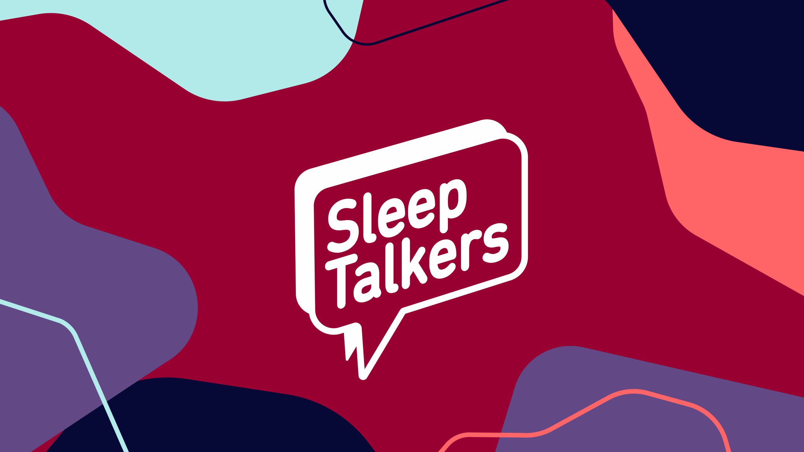
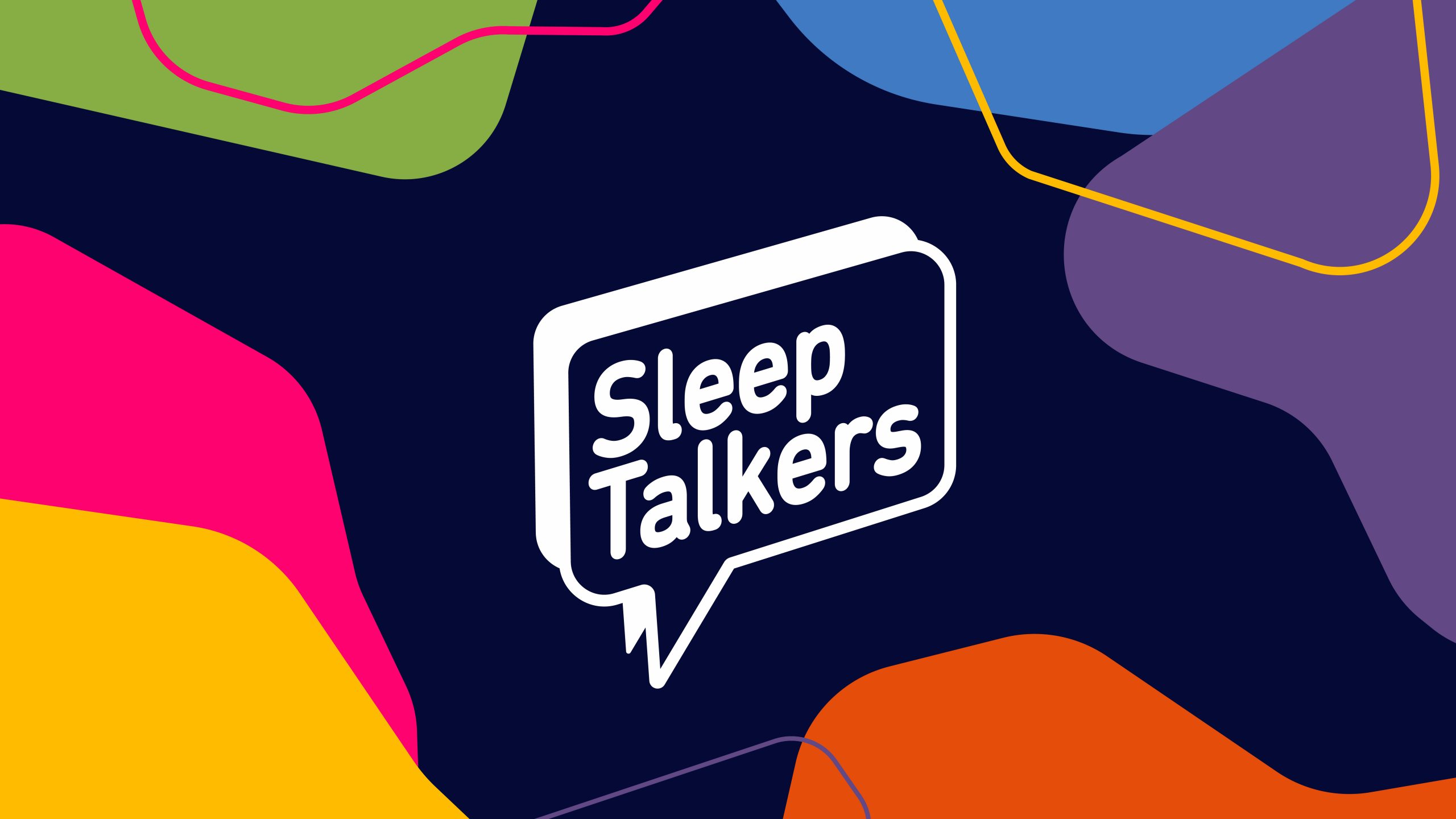
Initially, we put together concepts for the logo, focussing on the speech bubble icon and rounded typography. This was clear, bold and impactful.
Following this, we then put together a dynamic pattern which could be adapted to fit multiple applications across print and digital as well as changing the palette of colours that would help to provide a slightly different feel, depending on which audience we were talking to.
For SEND, we used blues and yellows and for the 50+ programme, we pulled in maroon, lilac and dark blue, helping to tone down the brightness.
Our overarching colour palette included pink, green, yellow and orange in bright tones which worked incredibly well with the master dark blue for the brand.
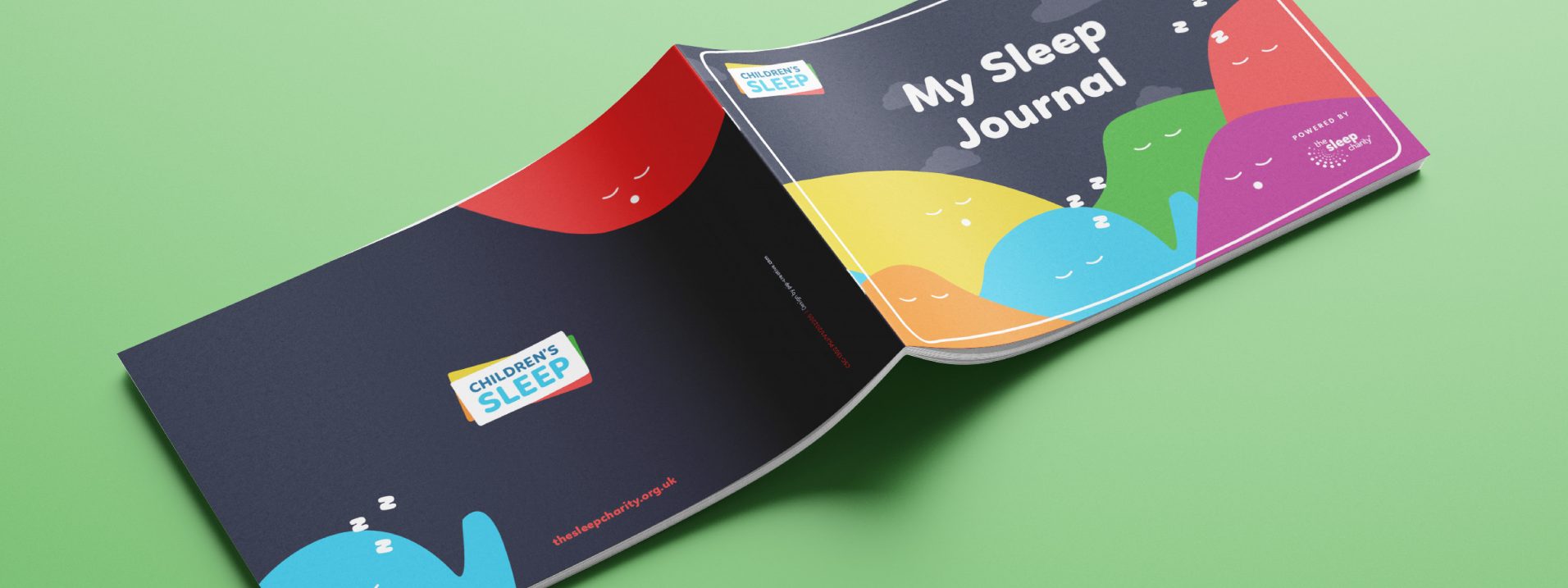
The applications that we have been working on include digital advertising and social media, printed collateral for the volunteers to use including resource packs and handbooks, as well as presentation decks and other collateral.
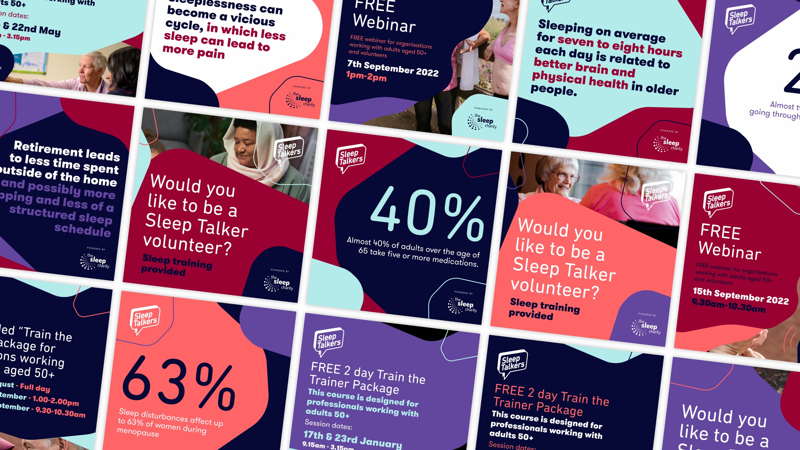
Social Graphic Styling
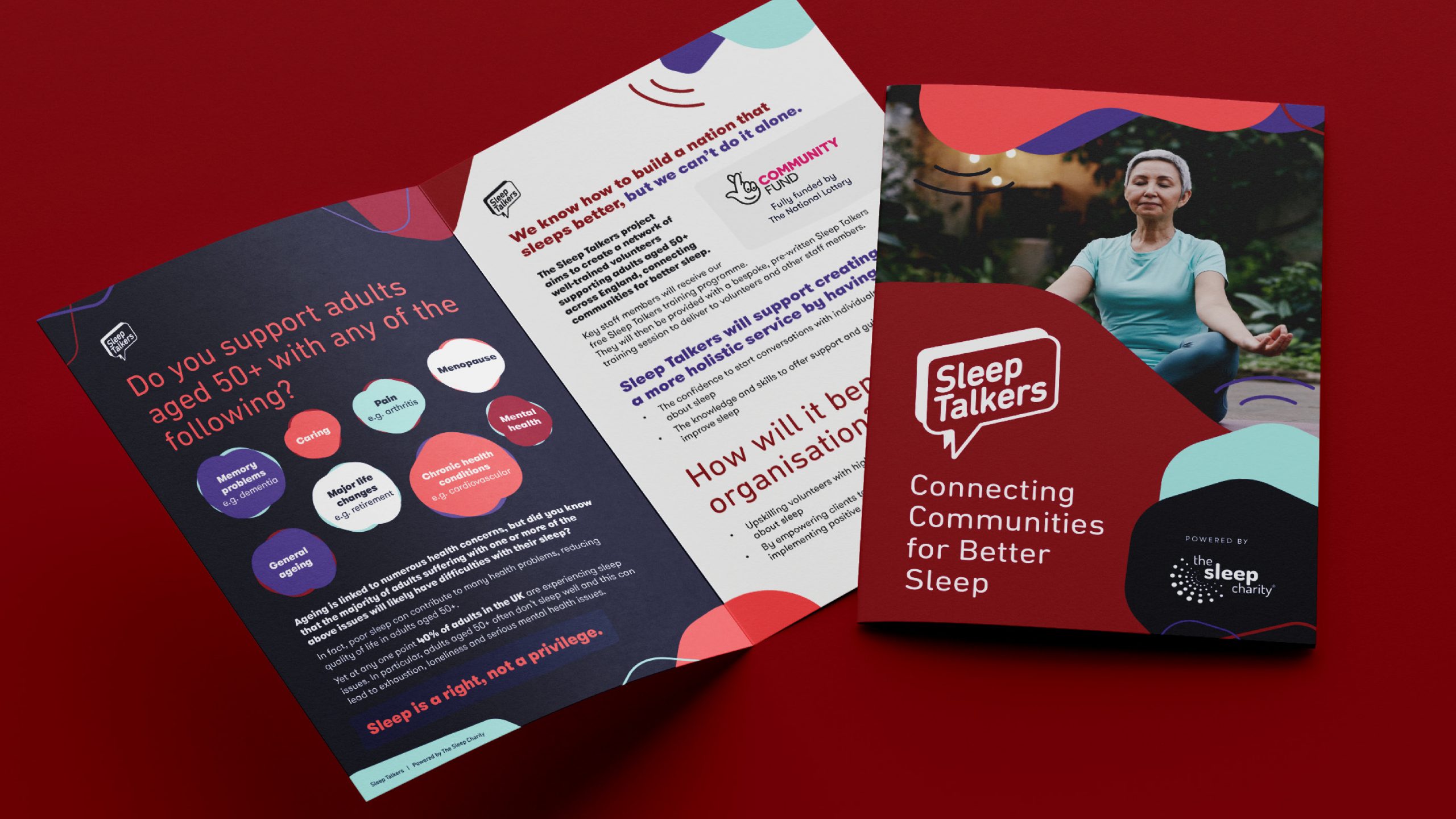
Advertising Collateral
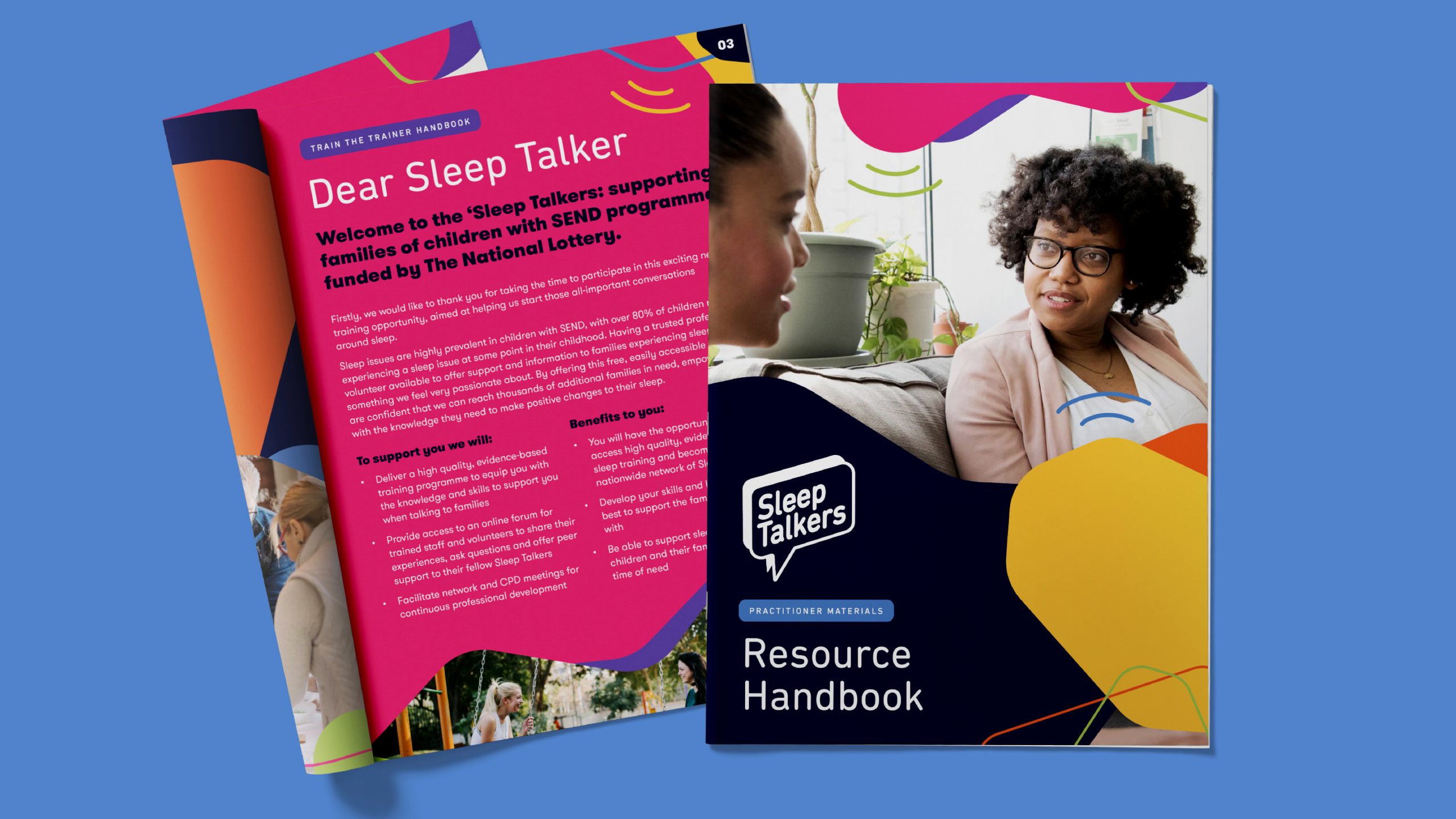
Workbook and Resource Packs
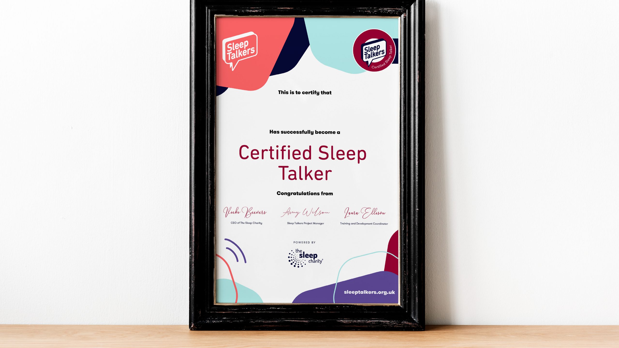
Certification
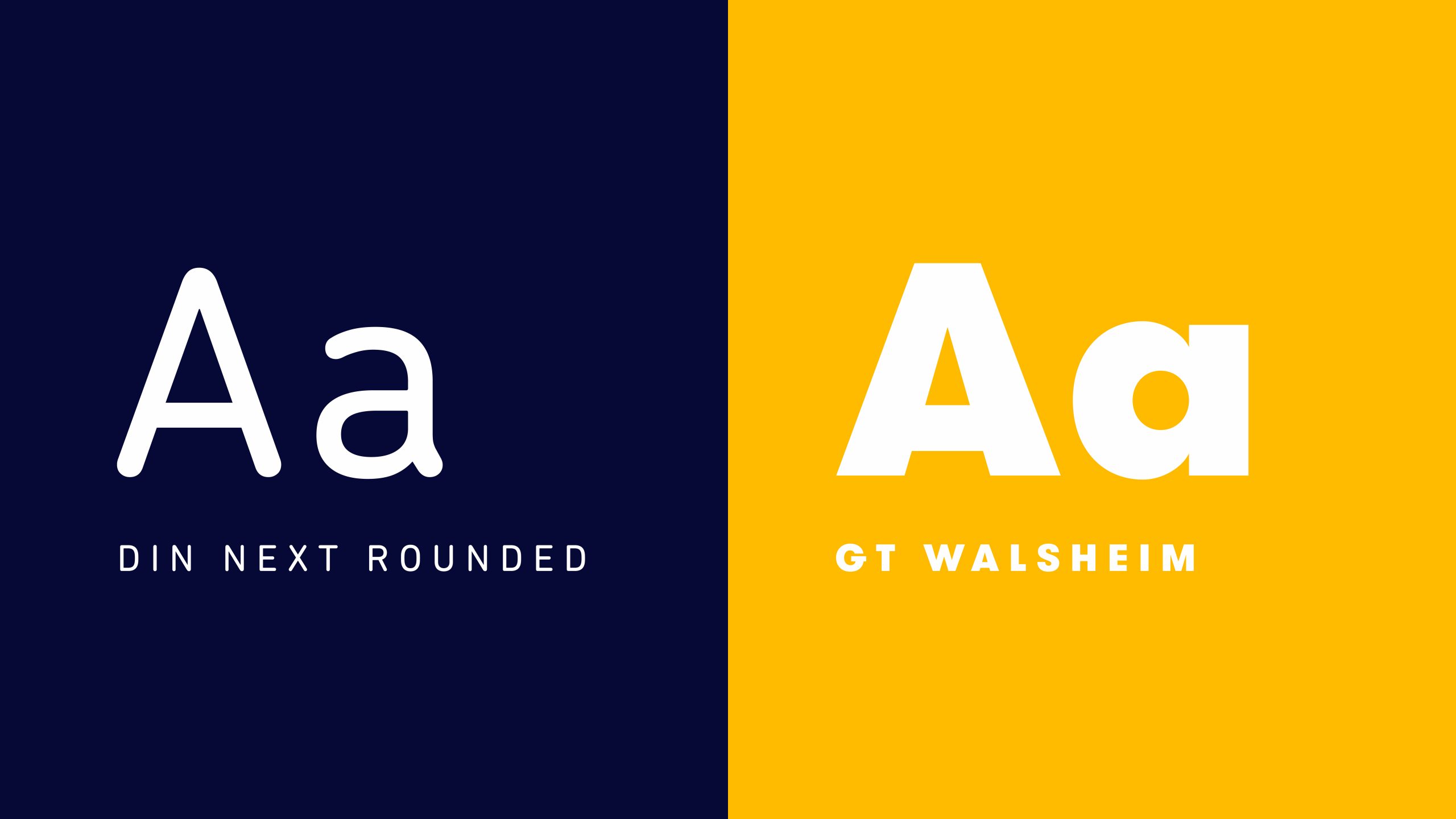
Typography Styles
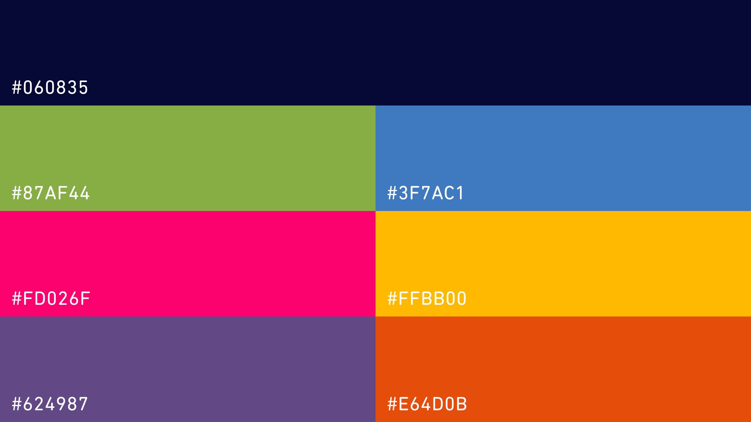
Master Colour Palette
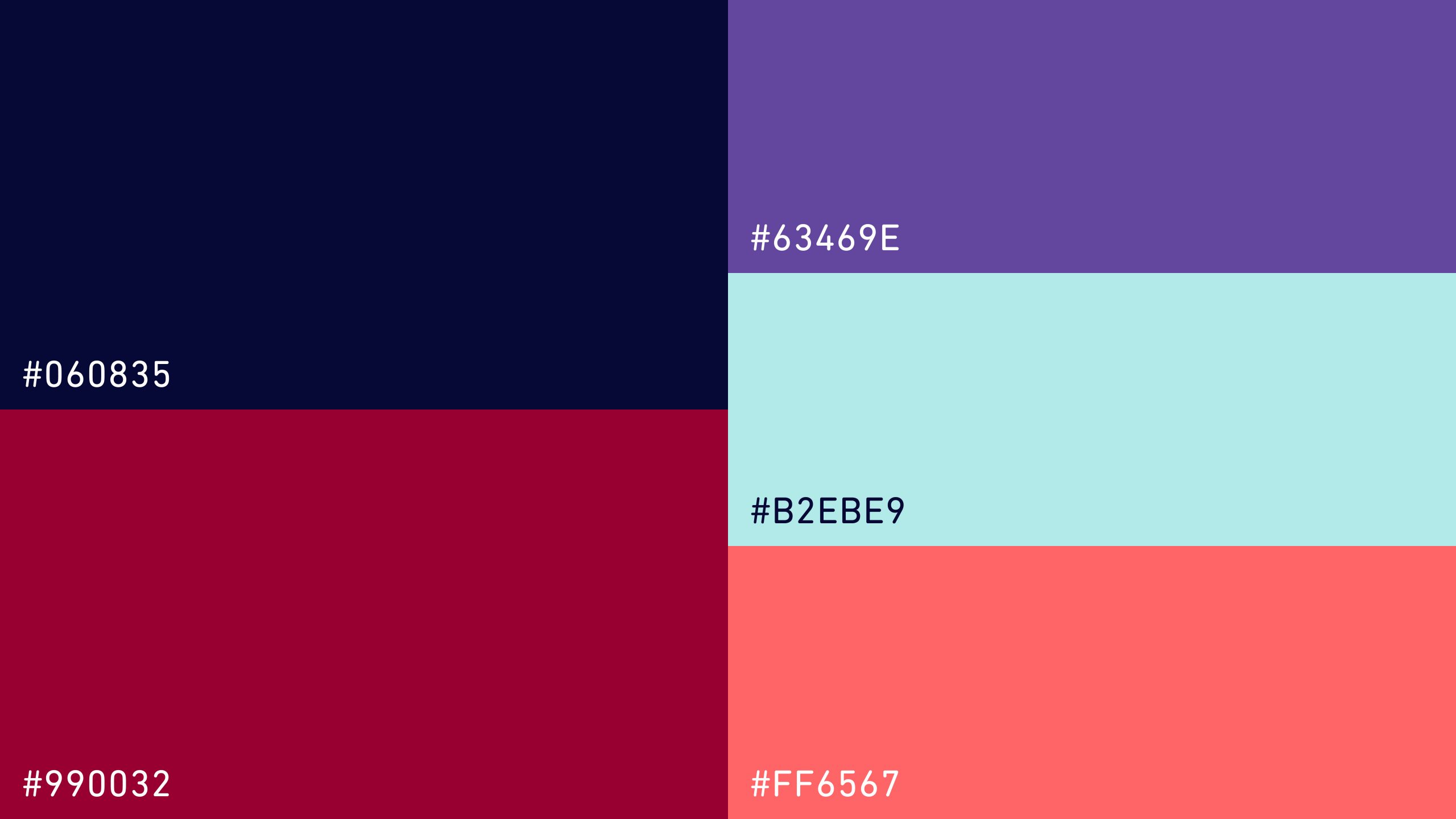
Sub-Colour Palette