The Project
March 2018
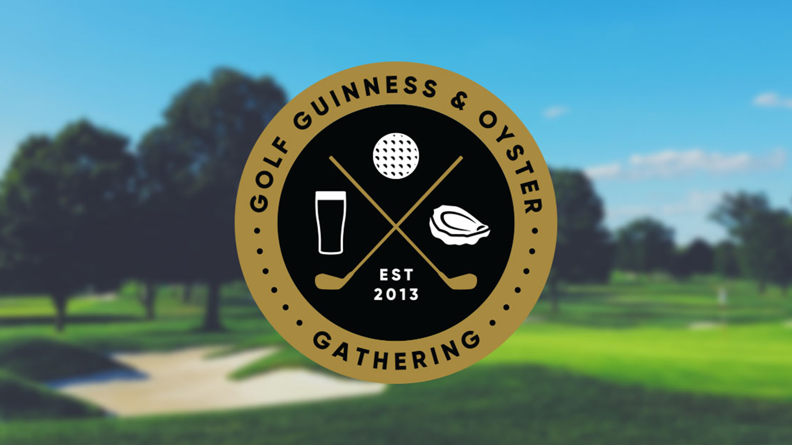
As part of its continuing growth and development, Golf Guinness & Oyster Gathering approached us to help with a fresh look and feel for 2018.
We were briefed by the tournament director to devise a brand that had heritage at its core and integrate visual prompts to allow users to instantly recognise what the tournament is about and what it offers. Another key factor to this brief was to devise something that could, later on down the line, be broken out into other types of events aimed at a similar market but with differing elements.
The classic roundel shape with looped typography was an immediate thought for us which came alongside some very edgy designs. In the end, classic was that way forward and we spent time crafting the iconography and the typography and looking at brand colours in order to create something that was relevant to its audience.
Alongside the brand, we recreated an e-vite style that is being used to approach potential participants and engage them with this invitation only event.
We have throughly enjoyed working with the team at GGOG and cannot wait to see the new brand in action across the many legs of the tournament in 2018.


