The Project
April 2017
Synetec is a financial software development company with over 15 years of technological experience.
Realising the need to change their branding was the first step for Synetec. In a world where technologies are constantly developing and evolving, they felt it was the right time to move their branding on and modernise.
In order to do this, we held a scope session to gauge the key core values of the business and see if these had moved on from the original set developed for the last round of branding, over 8 years ago. This scope session threw up many interesting questions and points around the key USP’s of Synetec, as well as enabling key decision makers to understand how their business was being perceived and how to develop this on.
With the brief written, we got to work developing an array of concepts based on the core values of trust, collaboration and delivery, as well as being mindful of the professional base of clients and the types of people that Synetec were looking to reach out to.
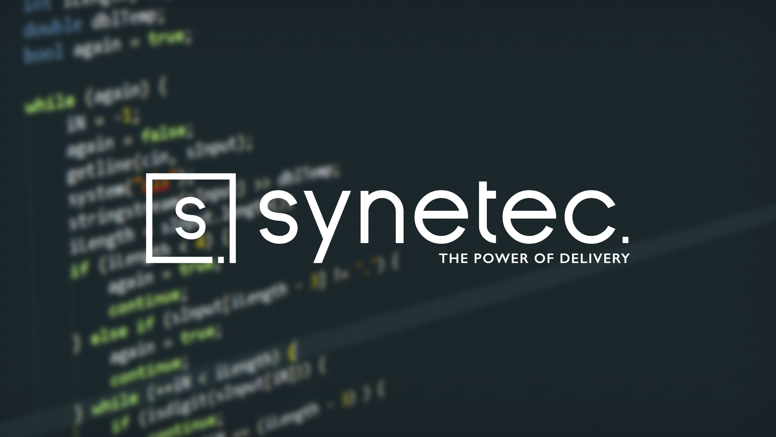
We developed a strong and clean-cut logo, utilising a modern, moulded typeface with unique glyphs and cuts to the lettering. We also utilised lower case lettering in order to create a more youthful and modern appeal to the brand.
The colours of blue and orange were retained from the current branding and this was to ensure some continuity across the transition from old to new. We did, however, update the tones of colours a little, in order to fit with the bold typography and icon that were created.
We are continuing our work with Synetec to develop their internal and external collateral as well as providing brand guidance and consultancy on various assets across print and digital media.


