The Project
March 2025
Bringing a ‘Touch of Redwood’ to life.
THE CHALLENGE
Redwood Consulting is an integrated PR and communications agency based in London, specialising in corporate, place, and political communications for the real estate sector. With over 30 years of industry experience, Redwood had built a solid reputation. However, following a recent management buy-out by Kate Bourne and Debbie Cracknell in 2024, the agency needed to reframe and rejuvenate its brand to better reflect its evolving focus.
The agency’s new direction required a brand overhaul that would unify the team behind a refreshed identity. The leadership team quickly recognised the need for a strategic and creative partner who could help them express their vision through a bold new visual identity and digital presence. Within three months of taking the reins, Redwood engaged with Pip to lead the rebrand, setting the stage for a transformative collaboration.
WHAT WE DID
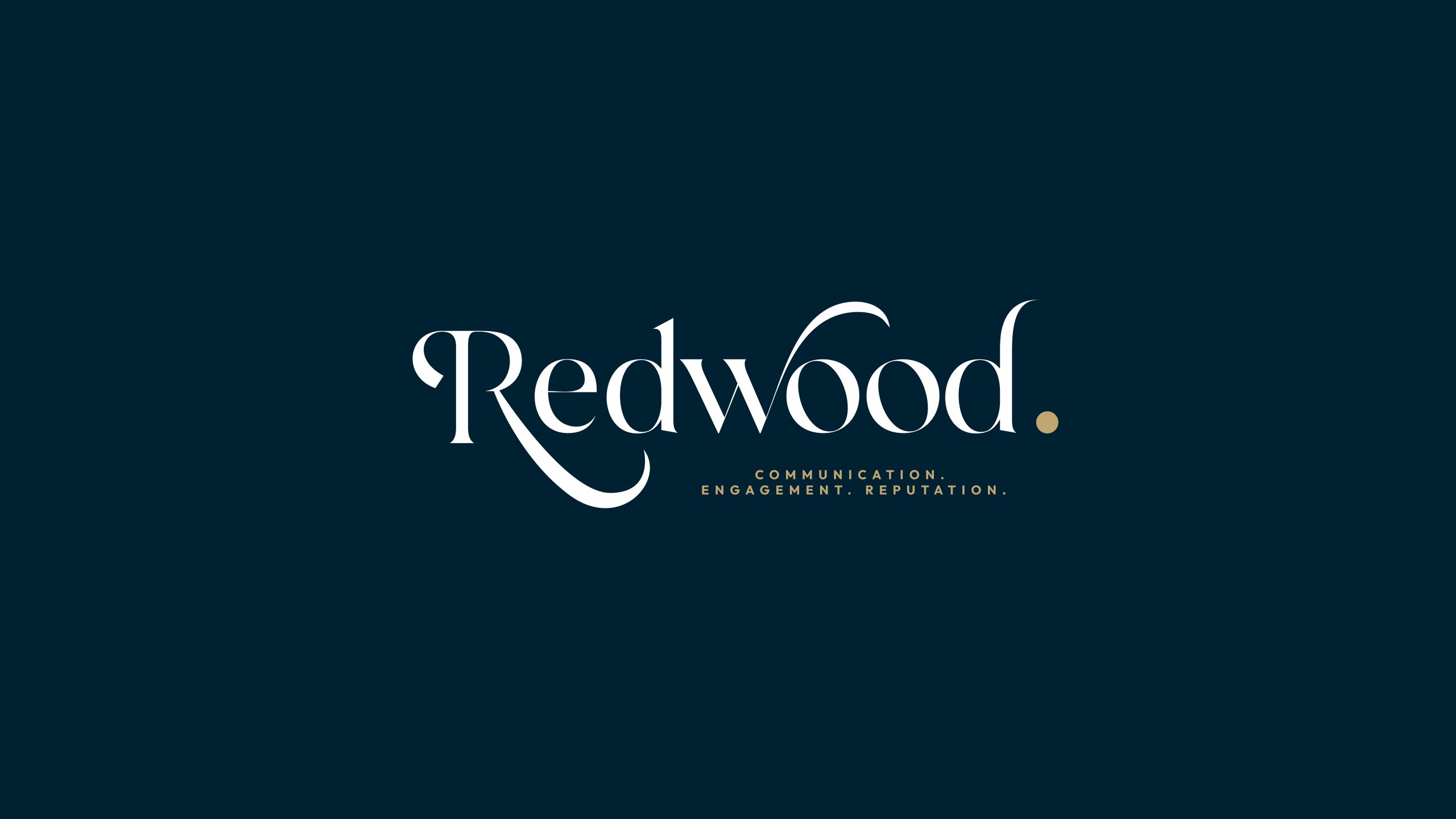
Brand & Visual Identity Development
We embarked on a comprehensive brand development process, working closely with our partner Tim Lewis to establish a new strategic foundation for Redwood. The goal was to define the agency’s core values and positioning, aligning them with the business’s fresh direction.
With these insights in hand, we created a series of creative concepts for the brand identity. Our concepts spanned a wide visual spectrum, from bold and vibrant to sophisticated with an added touch of flair. The result was a striking, modern design language that encapsulated Redwood’s dynamic energy and expertise, while keeping in mind its established reputation.
Website and Digital Design
Building on the visual identity, we developed a sleek brochure-style website that told the Redwood story in a compelling and cohesive manner. The website became a digital reflection of the agency’s core values and services, with a focus on user experience and clarity.
Key features included a team page showcasing new photography, which brought the faces behind the agency to the forefront. We also rewrote and revamped their catalogue of case studies, giving clear, concise descriptions of the agency’s work and successes in the real estate sector.

Credentials and Presentations
Ahead of Redwood’s annual trip to MIPIM, we created a credentials deck that perfectly reflected the newly developed brand. The deck showcased the agency’s work in a concise, visually appealing format, highlighting their expertise and the fresh energy brought about by the rebrand.
This presentation served as a powerful tool to engage with potential clients, collaborators, and industry leaders.

Brand Guidelines
To ensure consistent and effective use of the new visual identity across all touchpoints, we produced a comprehensive brand book. This document consolidated the strategic approach, including the logo’s usage guidelines, colour palette, typography, and imagery styling. The brand book empowered the Redwood team to confidently apply their new identity across all platforms and marketing materials.
THE IMPACT
The Redwood rebrand successfully brought the agency’s new vision to life, blending its established credibility with a bold, forward-looking identity. The refreshed brand and digital presence provided a strong foundation for Redwood’s next chapter, equipping the team with the tools to confidently communicate their expertise and ambitions, all with a little touch of Redwood.
With a compelling website, refined messaging, and cohesive visual identity, Redwood was able to make a significant impact at MIPIM and beyond, reinforcing its position as the integrated communications agency in the real estate sector.
By creating a brand that truly reflects its values and future aspirations, Redwood now stands stronger than ever – ready to shape conversations, build influence, and drive meaningful change.